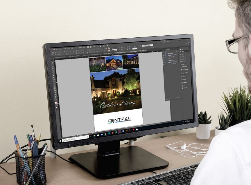
Moving forward in 2021, you want to ensure you implement a successful marketing strategy for the upcoming seasons. A key factor in ensuring your marketing strategy is successful is the look of your brand, that’s where graphic design comes into play. Having the right look to your company’s brand is critical–whether it’s for your website, social media, or any printing material such as brochures, door hangers and much more.
Having a consistent look to your brand will help your business stay ahead of your competitors. Your existing customers and potential new leads will recognize your branding across all channels. We understand creating the right look for your company and marketing strategy can be a challenge—especially now. That’s why we’ve provided you with 5 tips to help you elevate your graphic design and marketing for the upcoming season:
1. Authentic Photography
Graphic design is always influenced by the ongoing climate, and authenticity is becoming more important now than before. A simple way your designed social media posts, website banners, google my business promotions and more can become more authentic is to use your own photography. Stock images can still be useful, however it’s important to limit the amount of stock images you may use. This can be achieved by taking pictures of your crew working on site, a beautiful completed project, or even pictures of you and your team. The key is to personalize whichever graphic you’re creating as much as possible. Another approach can be using user-generated content as content your customers’ post of your completed projects is authentic itself.
2. Icons / Shapes
Icons have always been a powerful visual tool. Icons are very flexible and can be used in several different ways. They are consumed very quickly and can be understood with little to no context or text with it. For example, if you’re planning to promote a service for irrigation, including an icon of a sprinkler or water drop on your designed visual will convey the message that your designed visual is going to be about irrigation. If you’re planning to provide a special on lawn services, an icon of grass or leaf blades can be used. Depending on the context of your designed visual, it may need some additional information, but Icons are effective in helping your customers consume information quickly.
3. Typography
Your designed visuals don’t need to have vibrant colors in order to attract attention of your customers. Using modern, clean fonts can sometimes alone convey a message effectively. This can be done by using fonts with weights. An example can be making the header of your message bigger and bolder, and the information included a regular weight and smaller size. The bigger the text, the more importance it has and attention it will have compared to the smaller regular sized text. You want to be sure only the important text is bigger and bolder such as the header. Using two different fonts can also be helpful, but remember to only use 2 different fonts as using more than two can make the design look unbalanced.
4. Simple Data Visualization
Data visualization is simply taking complex data and making it easier to understand. It is normally done by creating graphs, think bar graphs or even pie charts. The purpose is to communicate information visually and convey your message quickly. For example, if your company provides outdoor lighting services, create a data visualization on why outdoor lighting can be beneficial for homes. An example can be “Outdoor Lighting Increases Home Safety by 80%”. This conveys your message quickly, and will help attract more customers to consider adding outdoor lighting to their homes.
5. Social Media Slide Decks
Social media can be used in many different ways, including sharing information in the form of social slide decks. The main social media platforms that display these slides well are Instagram and LinkedIn, while on Facebook you can put your slides together to create a slide show video. These slides are also meant to display minimal information quick and visually. They’re meant to be simple and provide information to your customers/audience within 3-6 slides. For example, you can create a few slides explaining to your customers when a customer may need aeration. The first slide can be titled “Signs It’s Time to Aerate & Seed Your Lawn”. If there are 3 things they need to look out for on their grass, then it will be 3 slides with each explaining the signs. Each slide can even include an image of what each sign looks like. It can be set up as the following:
- Slide 1: Signs It’s Time To Aerate & Seed Your Lawn
- Slide 2: Puddles Indicate Compacted Soil
- Slide 3: Discolored Areas
- Slide 4: Warn Areas or Patches
This is one example of many ways slide decks can be created to attract the attention of your customers and help them become aware of a needed service.
Finally, rely on Central to help, whether it’s questions about marketing strategy, strategic purchasing, or business planning during COVID-19. Central is the right partner for your business. We stay at the leading edge of the industry and we’re ready to help you grow!

